Client
Melinda Group - Sanitary installations and accessories
Services
Rebranding, Visual Identity, Print
Year
2024
Website
www.leveluptb.ro
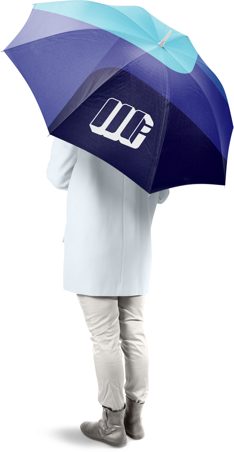
For Melinda Group’s brand refresh, we reimagined the long-standing Melinda Instal logo into a unified identity for the entire company group. The new design retains the familiar “M” form—slightly rotated in space—while integrating distinct letters for each subunit, ensuring both cohesion and recognition. This approach allows the brand to grow seamlessly as new departments are added. The result is a modern, timeless, and versatile identity that balances stability, reliability, and dynamism. Clean typography and bold simplicity ensure effortless use across all media, while honoring the trust of long-standing clients and appealing to new audiences alike.
Original logo
New updated logo
Elements of
the new Logo
concept:
The letter M
The main, frontal element of the symbols remains a refreshed letter M, the initial of the company’s name.
The letters I,G and S
The symbols are slightly rotated in space, and the side plane shows the initial of the given subunit.

Modern, bold
typography
ABCDEFGHIJKLMNOPQRSTUVWXYZ
The logo
on different
surfaces

some other
possible
uses

